


Building a simple candlestick chart using Docker, FastAPI, and Vue 3 - Part 4
Vuelidate for form validation


Table of contents
In the last article we created custom JVPSelect and JVPInput components that look horrendous and also that have no data validation.
In this article we will add input validation using a third-party library called Vuelidate.
Initial setup
We will be instantiating the Vuelidate object in Selections.vue instead of in JVPInput.vue.
We do this because the JVPInput component is, in effect, simply a wrapper.
We want to be able to use validation, but the rules and validation state for the purposes of form submission need to reside where the full form data resides.
The first thing we need to do is install Vuelidate
npm install @vuelidate/core @vuelidate/validators
From here we can either incorporate it globally in the project or import it into each component we want to use it. We will use Vuelidate in the latter way. We first import the library and necessary validators into our component
import useVuelidate from '@vuelidate/core';
import { required, maxLength } from '@vuelidate/validators';
Then we instantiate the object and set the validation rules for the symbol attribute of the form
const rules = {
  symbol: { required, maxLength: maxLength(5) },
};
const v$ = useVuelidate(rules, state);
where the state element is the reactive element that we've already set in the component.
The above rules set the symbol attribute to be required and to be no longer than 5 characters, though you can set it to whatever you want.
Custom validators
We also want to check that if we've included data for both the startDate and endDate attributes that the former is earlier than the latter.
We first need to extend the rules that were initially created before
const rules = {
  symbol: { required, maxLength: maxLength(5) },
  startDate: {
    validateDateFormat,
    mustBeEarlierDate,
  },
  endDate: {
    validateDateFormat,
  },
};
const v$ = useVuelidate(rules, state });
The first thing we want to do is first check to see if the value passed in is a valid date.
const checkDateFormat = (param) => {
  if (!param) return true;
  return new Date(param).toString() !== 'Invalid Date';
};

const validateDateFormat = helpers.withMessage(
  'Please enter a valid date.',
  checkDateFormat
);
The checkDateFormat function follows methodology in the Custom error messages documentation on the Vuelidate docs.
Then we want to check that the value passed in is earlier than the reactive state's endDate value.
const mustBeEarlierDate = helpers.withMessage(
  'Start date must be earlier than end date.',
  (value) => {
    const endDate = computed(() => state.endDate);
    if (!value || !endDate.value) return true;
    if (!checkDateFormat(endDate.value)) return true;
    return new Date(value) < new Date(endDate.value)
  }
);
The mustBeEarlierDate function follows methodology in the Passing extra properties to validators documentation on the Vuelidate docs.
We need to be careful, though, as we don't care about this validation if either of the dates is not included, but only if both are set.
We can now check to see that the functionality works properly by inputting valid and invalid values to the form and clicking the Get Chart button.
We should see the triggered handleSubmit text any time we click the button except when both the start and end date being included and the start date is not strictly less than the end date.
The updated Selections.vue component should now look like this
<template>
  <form class="ml-5" @submit.prevent="handleSubmit">
    <div class="my-1">
      <JVPInput
        v-model="state.symbol"
        label="Symbol"
        id="symbol"
        name="symbol"
        type="text"
        placeholder="eg. MSFT"
        :vuelidate="v$.symbol"
      />
    </div>
    <div class="my-1">
      <JVPInput
        v-model="state.startDate"
        label="Start Date"
        id="start-date"
        name="startDate"
        type="text"
        :vuelidate="v$.startDate"
      />
    </div>
    <div class="my-1">
      <JVPInput
        v-model="state.endDate"
        label="End Date"
        id="end-date"
        name="endDate"
        type="text"
        :vuelidate="v$.endDate"
      />
    </div>
    <div class="my-1">
      <JVPSelect
        v-model="state.interval"
        label="Interval"
        id="interval"
        :options="intervals"
      />
    </div>
    <button type="submit" class="border-4 border-indigo-500">Get Chart</button>
  </form>
</template>

<script>
import { defineComponent, reactive, computed } from 'vue';
import useVuelidate from '@vuelidate/core';
import { required, maxLength, helpers } from '@vuelidate/validators';
import JVPInput from './JVPInput.vue';
import JVPSelect from './JVPSelect.vue';

export default defineComponent({
  components: { JVPInput, JVPSelect },
  setup() {
    const intervals = ['Daily', 'Weekly', 'Monthly'];

    const state = reactive({
      symbol: '',
      interval: 'Daily',
      startDate: '',
      endDate: '',
    });

    const mustBeEarlierDate = helpers.withMessage(
      'Start date must be earlier than end date.',
      (value) => {
        const endDate = computed(() => state.endDate);
        if (!value || !endDate.value) return true;
        if (!checkDateFormat(endDate.value)) return true;
        return new Date(value) < new Date(endDate.value);
      }
    );

    const checkDateFormat = (param) => {
      if (!param) return true;
      return new Date(param).toString() !== 'Invalid Date';
    };

    const validateDateFormat = helpers.withMessage(
      'Please enter a valid date.',
      checkDateFormat
    );

    const rules = {
      symbol: { required, maxLength: maxLength(5) },
      startDate: {
        validateDateFormat,
        mustBeEarlierDate,
      },
      endDate: {
        validateDateFormat,
      },
    };
    const v$ = useVuelidate(rules, state);

    const disabled = computed(() => {
      return v$.value.$invalid;
    });

    const handleSubmit = () => {
      v$.value.$validate();
      if (!v$.value.$invalid) {
        console.log('triggered handleSubmit');
      }
    };

    return {
      intervals,
      state,
      disabled,
      v$,
      handleSubmit,
    };
  },
});
</script>
Display error messages
This is all fine and good, but we need to somehow let the user know when the form is in an error state.
In order to do this we need to add v$ to the return of the setup function in the component so that we can access it in the template and pass it down to the JVPInput.vue components.
Next we need to update the props in the JVPInput.vue component to include this new object, which we'll simply call vuelidate.
The props for this component should now look like
props: {
  type: {
    type: String,
    required: false,
    default: 'text',
  },
  placeholder: {
    type: String,
    required: false,
  },
  vuelidate: {
    type: Object,
    required: false,
    default: () => ({})
  },
  ...inputProps,
},
and we'll add in an extra attribute to each JVPInput instance in Selections.vue, calling the specific element of the v$ object.
It will look something like
<JVPInput
  v-model="state.startDate"
  label="Start Date"
  id="start-date"
  name="startDate"
  type="text"
  :vuelidate="v$.startDate"
/>
Once this is done we can then set some computed properties in the JVPInput.vue component to check if the input is in an error state and, if it is, create a dynamic errorText element.
// Vuelidate is used as a validation library.
// We use built-in functionality to determine if any rules are violated
// as well as display of the associated error text
const isError = computed(() => props.vuelidate.$error);
const errorText = computed(() => {
  const messages =
    props.vuelidate.$errors?.map((err) => err.$message) ?? [];
  return messages.join(' ');
});
We then want to add the isError and errorText elements to the return statement in the setup function in JVPInput.vue and add in some markup to display the text if and only if there is an error.
We can add in a simple <p> tag to conditionally display the error messages, and the updated JVPInput.vue component should look like
<template>
  <div>
    <label :for="id" class="block text-sm font-medium text-gray-700">
      {{ label }}
    </label>
    <div class="mt-1 relative rounded-md shadow-sm">
      <input
        :value="modelValue"
        :type="type"
        :name="id"
        :id="id"
        class="block w-full sm:text-sm rounded-md shadow-sm"
        @input="updateValue"
      />
    </div>
    <p v-if="isError">{{ errorText }}</p>
  </div>
</template>

<script>
import { defineComponent, computed } from 'vue';
import inputProps from '../utils/input-props';

export default defineComponent({
  props: {
    type: {
      type: String,
      required: false,
      default: 'text',
    },
    placeholder: {
      type: String,
      required: false,
    },
    vuelidate: {
      type: Object,
      required: false,
      default: () => ({}),
    },
    ...inputProps,
  },
  emits: ['update:modelValue'],
  setup(props, { emit }) {
    // This is simply cleaner than putting emit code in the HTML
    const updateValue = (e) => emit('update:modelValue', e.target.value);

    // Vuelidate is used as a validation library.
    // We use built-in functionality to determine if any rules are violated
    // as well as display of the associated error text
    const isError = computed(() => props.vuelidate.$error);
    const errorText = computed(() => {
      const messages =
        props.vuelidate.$errors?.map((err) => err.$message) ?? [];
      return messages.join(' ');
    });

    return { updateValue, isError, errorText };
  },
});
</script>
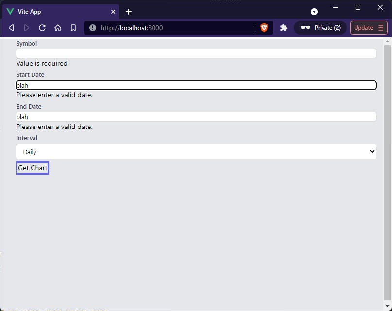
Now we can see that if we don't include a symbol, set the date fields to be random text, and click the Get Chart button then we should see something that looks like
 In the next article we'll add in hint text, then we'll add in some conditional styling based on whether the form is in an error state or not.