
Building a simple candlestick chart using Docker, FastAPI, and Vue 3 - Part 5
Hint text and styling


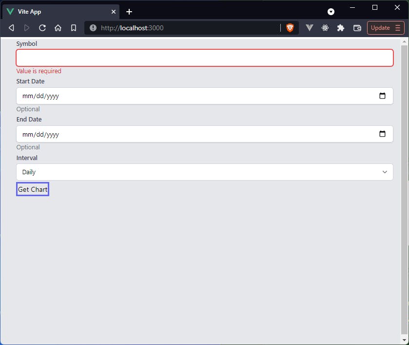
In the last article we added validation to the JVPInput.vue components using a library called Vuelidate.
Upon an invalid entry to any of these components, we had a line of text appear below the input to indicate that it was invalid.
Now that we have a place to put error text, we should make use of that space in case we want a hint to go there.
We have already included the hint prop in our input-props.js file, so we don't need to add anything there.
Now all we need to do to pass the hint to the JVPInput component is add it anywhere we want it displayed.
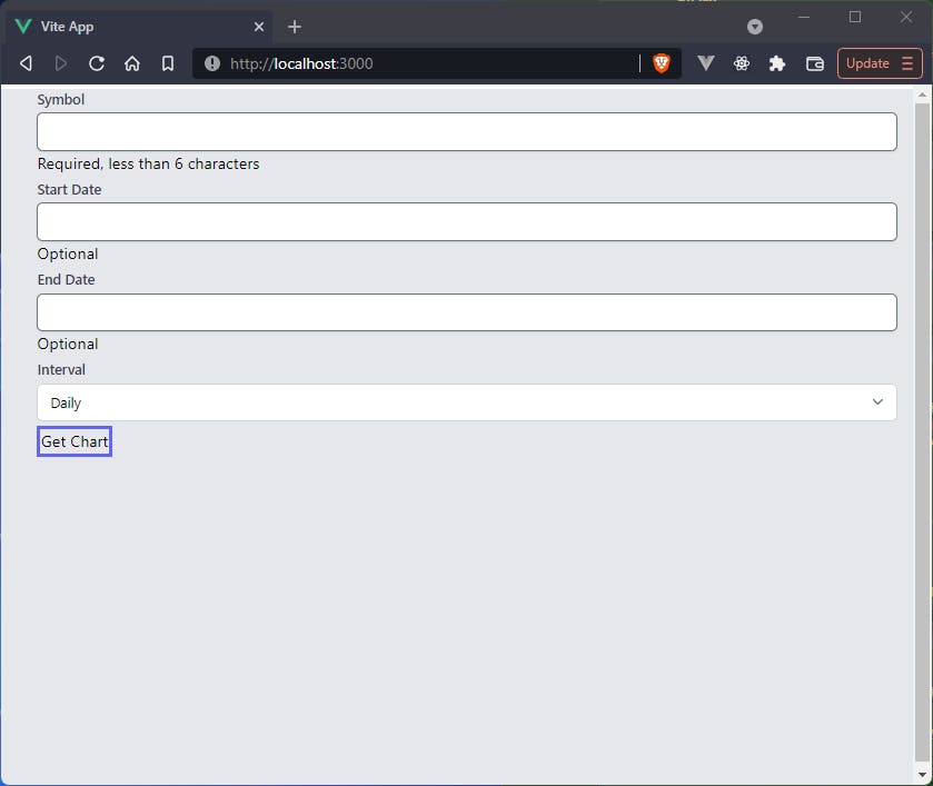
For example, we want to tell the user that the symbol attribute is required and the dates are optional, so we would pass these in as hints.
<div class="my-1">
  <JVPInput
    v-model="state.symbol"
    label="Symbol"
    id="symbol"
    name="symbol"
    type="text"
    placeholder="eg. MSFT"
    :vuelidate="v$.symbol"
    hint="Required, less than 6 characters"
  />
</div>
<div class="my-1">
  <JVPInput
    v-model="state.startDate"
    label="Start Date"
    id="start-date"
    name="startDate"
    type="text"
    :vuelidate="v$.startDate"
    hint="Optional"
  />
</div>
<div class="my-1">
  <JVPInput
    v-model="state.endDate"
    label="End Date"
    id="end-date"
    name="endDate"
    type="text"
    :vuelidate="v$.endDate"
    hint="Optional"
  />
</div>
Hint/error logic
The next thing we need to do is incorporate the hint vs. error logic within the component script itself.
We will be using the same space to display hints and errors, but we don't want to display a hint when an input is in an error state.
We also want the text displayed to be dynamic depending on the state of the input.
To that end, we'll add another computed property to JVPInput.vue
const hintText = computed(() => {
  if (errorText.value.length > 0) return errorText.value;
  if (!!props.hint) return props.hint;
  return '';
})
What this little property does is it displays any error messages, if they exist. If they don't, but a hint was passed down as a prop, then display the hint, otherwise just remain empty. We can then add
const hasHint = computed(() => !!hintText.value.length);
which will be truthy whether there is a hint or there are any error messages. Now the error text markup will be replaced with
<p v-if="hasHint">{{ hintText }}</p>
after having included both hasHint and hintText in the return section of the setup function.
Styling
Now we need to add some styling.
The app still looks pretty horrendous so we need to clean it up a bit.
The first thing we notice, though, is that there seems to be no highlighting around the JVPSelect.vue element.
If we think back a bit, we included focus:ring-indigo-500 and focus:border-indigo-500 as classes on this element but as we tab through we don't see any of those.
The reason for this is because we need to install
npm i @tailwindcss/forms
and include an extra plugin for Tailwind
// tailwind.config.js
module.exports = {
  mode: 'jit',
  purge: ['./index.html', './src/**/*.{vue,js,ts,jsx,tsx}'],
  darkMode: false, // or 'media' or 'class'
  theme: {
    extend: {},
  },
  variants: {
    extend: {},
  },
  plugins: [require('@tailwindcss/forms')], // <-- *** New line ***
}
By simply adding this plugin the form looks a bit better and we can see that in the focus state the JVPSelect.vue component has the correct highlighting.
 What we want to do next for the
 JVPInput.vue component is create a sort of dynamic class that will display certain properties when in a valid state and other properties in an error state.
// This is solely to style the input based on whether it is in an error state or not
const dynamicClass = computed(() => {
  // This is to remove padding on the right for the built-in calendar icon when using a date type
  let val = props.type === 'date' ? '' : 'pr-10';
  return isError.value
    ? `${val} border-red-300 text-red-900 placeholder-red-300 focus:outline-none focus:ring-red-500 focus:border-red-500`
    : `${val} focus:ring-indigo-500 focus:border-indigo-500 border-gray-300`;
});
We will then update the class of the hint slightly and dynamically set the id value for the hint
// The "hint" text will display any necessary hints as well as any error messages.
// Styling and values of said hint text are primarily based on whether an input is in an error state.
const hintClass = computed(() =>
  isError.value ? 'text-red-600' : 'text-gray-500'
);
const hintId = computed(() =>
  isError.value ? `${props.id}-error` : `${props.id}-input`
);
We then pass the dynamicClass variable into the return statement of the setup function and add an extra line to the input tag
<input
  :value="modelValue"
  :type="type"
  :name="id"
  :id="id"
  class="block w-full sm:text-sm rounded-md shadow-sm"
  :class="dynamicClass"
  @input="updateValue"
/>
What this will do is always set the class to be block w-full sm:text-sm rounded-md shadow-sm regardless of the error state, but then it also adds on the extra elements defined in dynamicClass, which are dependent on the error state of the input.
We then want to add a bit of extra styling to the hint text itself just to give it a secondary focus.
<p v-if="hasHint" class="mt-0 text-sm" :class="hintClass" :id="hintId">
  {{ hintText }}
</p>
after having added the hintClass and hintId elements to the return statement of the setup function, of course.
Finishing touches on JVPInput.vue
To tie off the loose ends on the JVPInput.vue component there are just a few more things we want to add
- A couple of
ariaattributes - Tell
vuelidateto validate each input on ablurevent - Add autofocus as a prop and bind it to the input
<input
  :value="modelValue"
  :type="type"
  :name="id"
  :id="id"
  class="block w-full sm:text-sm rounded-md shadow-sm"
  :class="dynamicClass"
  :aria-invalid="isError"
  :aria-describedby="hintId"
  :autofocus="autofocus"
  @input="updateValue"
  @blur="vuelidate.$touch"
/>
You can see in the code snippet above we're accessing vuelidate and autofocus directly instead of via the props.
In order to do this we simply need to update the return statement like so
return {
  hasHint,
  hintText,
  hintClass,
  hintId,
  dynamicClass,
  isError,
  autofocus: props.autofocus,
  vuelidate: props.vuelidate,
  updateValue,
};
To tie a final bow on this component, we will actually update two things in Selections.vue.
You'll notice when creating the dynamicClass variable we allowed for a class of pr-10 if the type prop passed in is "date".
This will automatically add in the calendar icon, so in Selections.vue we'll change the type of startDate and endDate to be "date".
Summary
Now that all of that is done, we've nearly finished with the form components.
What we will do in the next, short, article will be adding in svg icons to the project so that we can easily include them in our code wherever we need.
We will also style the button because the rest of the form is starting to look nice and clean and the button is still pretty ugly.
For the purpose of copy-pasting, the two components we updated in this section are Selections.vue and JVPInput.vue, the updated versions of both of which are presented now.
Selections.vue
<template>
  <form class="ml-5" @submit.prevent="handleSubmit">
    <div class="my-1">
      <JVPInput
        v-model="state.symbol"
        label="Symbol"
        id="symbol"
        name="symbol"
        type="text"
        placeholder="eg. MSFT"
        :vuelidate="v$.symbol"
        hint="Required, less than 6 characters"
        :autofocus="true"
      />
    </div>
    <div class="my-1">
      <JVPInput
        v-model="state.startDate"
        label="Start Date"
        id="start-date"
        name="startDate"
        type="date"
        :vuelidate="v$.startDate"
        hint="Optional"
      />
    </div>
    <div class="my-1">
      <JVPInput
        v-model="state.endDate"
        label="End Date"
        id="end-date"
        name="endDate"
        type="date"
        :vuelidate="v$.endDate"
        hint="Optional"
      />
    </div>
    <div class="my-1">
      <JVPSelect
        v-model="state.interval"
        label="Interval"
        id="interval"
        :options="intervals"
      />
    </div>
    <button type="submit" class="border-4 border-indigo-500">Get Chart</button>
  </form>
</template>

<script>
import { defineComponent, reactive, computed } from 'vue';
import useVuelidate from '@vuelidate/core';
import { required, maxLength, helpers } from '@vuelidate/validators';
import JVPInput from './JVPInput.vue';
import JVPSelect from './JVPSelect.vue';

export default defineComponent({
  components: { JVPInput, JVPSelect },
  setup() {
    const intervals = ['Daily', 'Weekly', 'Monthly'];

    const state = reactive({
      symbol: '',
      interval: 'Daily',
      startDate: '',
      endDate: '',
    });

    const mustBeEarlierDate = helpers.withMessage(
      'Start date must be earlier than end date.',
      (value) => {
        const endDate = computed(() => state.endDate);
        if (!value || !endDate.value) return true;
        if (!checkDateFormat(endDate.value)) return true;
        return new Date(value) < new Date(endDate.value);
      }
    );

    const checkDateFormat = (param) => {
      if (!param) return true;
      return new Date(param).toString() !== 'Invalid Date';
    };

    const validateDateFormat = helpers.withMessage(
      'Please enter a valid date.',
      checkDateFormat
    );

    const rules = {
      symbol: { required, maxLength: maxLength(5) },
      startDate: {
        validateDateFormat,
        mustBeEarlierDate,
      },
      endDate: {
        validateDateFormat,
      },
    };
    const v$ = useVuelidate(rules, state);

    const disabled = computed(() => {
      return v$.value.$invalid;
    });

    const handleSubmit = () => {
      v$.value.$validate();
      if (!v$.value.$invalid) {
        console.log('triggered handleSubmit');
      }
    };

    return {
      intervals,
      state,
      disabled,
      v$,
      handleSubmit,
    };
  },
});
</script>
JVPInput.vue
<template>
  <div>
    <label :for="id" class="block text-sm font-medium text-gray-700">
      {{ label }}
    </label>
    <div class="mt-1 relative rounded-md shadow-sm">
      <input
        :value="modelValue"
        :type="type"
        :name="id"
        :id="id"
        class="block w-full sm:text-sm rounded-md shadow-sm"
        :class="dynamicClass"
        :aria-invalid="isError"
        :aria-describedby="hintId"
        :autofocus="autofocus"
        @input="updateValue"
        @blur="vuelidate.$touch"
      />
    </div>
    <p v-if="hasHint" class="mt-0 text-sm" :class="hintClass" :id="hintId">
      {{ hintText }}
    </p>
  </div>
</template>

<script>
import { defineComponent, computed } from 'vue';
import inputProps from '../utils/input-props';

export default defineComponent({
  props: {
    type: {
      type: String,
      required: false,
      default: 'text',
    },
    placeholder: {
      type: String,
      required: false,
    },
    vuelidate: {
      type: Object,
      required: false,
      default: () => ({}),
    },
    autofocus: {
      type: Boolean,
      required: false,
      default: false
    },
    ...inputProps,
  },
  emits: ['update:modelValue'],
  setup(props, { emit }) {
    // This is simply cleaner than putting emit code in the HTML
    const updateValue = (e) => emit('update:modelValue', e.target.value);

    // Vuelidate is used as a validation library.
    // We use built-in functionality to determine if any rules are violated
    // as well as display of the associated error text
    const isError = computed(() => props.vuelidate.$error);
    const errorText = computed(() => {
      const messages =
        props.vuelidate.$errors?.map((err) => err.$message) ?? [];
      return messages.join(' ');
    });

    // This is solely to style the input based on whether it is in an error state or not
    const dynamicClass = computed(() => {
      // This is to remove padding on the right for the built-in calendar icon when using a date type
      let val = props.type === 'date' ? '' : 'pr-10';
      return isError.value
        ? `${val} border-red-300 text-red-900 placeholder-red-300 focus:outline-none focus:ring-red-500 focus:border-red-500`
        : `${val} focus:ring-indigo-500 focus:border-indigo-500 border-gray-300`;
    });

    // The "hint" text will display any necessary hints as well as any error messages.
    // Styling and values of said hint text are primarily based on whether an input is in an error state.
    const hintClass = computed(() =>
      isError.value ? 'text-red-600' : 'text-gray-500'
    );
    const hintId = computed(() =>
      isError.value ? `${props.id}-error` : `${props.id}-input`
    );

    const hintText = computed(() => {
      if (errorText.value.length > 0) return errorText.value;
      if (!!props.hint) return props.hint;
      return '';
    });

    const hasHint = computed(() => !!hintText.value.length);

    return {
      hasHint,
      hintText,
      hintClass,
      hintId,
      dynamicClass,
      isError,
      autofocus: props.autofocus,
      vuelidate: props.vuelidate,
      updateValue,
    };
  },
});
</script>
and the updated form looks much better