


Building a simple candlestick chart using Docker, FastAPI, and Vue 3 - Part 6
Button Styling and Icons


Table of contents
In the last article we styled the form a bit better and added conditional styling based on the data validation from Vuelidate. The button still looks pretty ugly, though, so we'll style that in this article as well as add in any necessary functionality. We'll also add in some icon functionality to make it easy to include them wherever we need, as well.
Styling the button
We initially added in "placeholder" classes so the button actually looked like something.
We'll remove the border-4 and border-indigo-500 classes and replace them with the following:
w-full-> take up the full width of the parent containerh-12-> fixing height, this will be beneficial for a loading icon laterpx-6-> some horizontal paddingmt-6-> margin on the top to clear it from theJVPSelect.vuecomponentlg:mt-0-> removing said margin when onlgorxlbreakpoints, as declared by Tailwindrounded-lg-> just rounding the corners a bit to look nicerbg-indigo-700-> background coloringtext-indigo-100-> a similar text shade to the background, but with enough contrasttransition-colors-> a transition class that will only transition the color attributes that will be updatedduration-150-> setting a duration for the aforementioned transitionshover:bg-indigo-800-> a slightly darker color on hover (this is where thetransition-colorswill have an affect)focus:shadow-outline-> a subtle outline when the button is focused, as in when tabbing through inputsdisabled:opacity-50-> setting the opacity to be 50% if the button is disableddisabled:cursor-not-allowed-> disable the standard pointer cursor for a button when the button is disabled
Button logic
In the previous article we didn't include any disabled functionality on the button because we wanted to include good feedback for error handling. Now we can include disabled functionality, which we started in the previous article where we set up a computed property:
const disabled = computed(() => {
  return v$.value.$invalid;
});
All we need to do now is add a dynamic :disabled property to the button in the template.
Now the button markup looks like this
<button
  type="submit"
  class="
    w-full
    h-12
    px-6
    mt-6
    lg:mt-0
    rounded-lg
    bg-indigo-700
    text-indigo-100
    transition-colors
    duration-150
    hover:bg-indigo-800
    focus:shadow-outline
    disabled:opacity-50
    disabled:cursor-not-allowed
  "
  :disabled="disabled"
>
  Get Chart
</button>
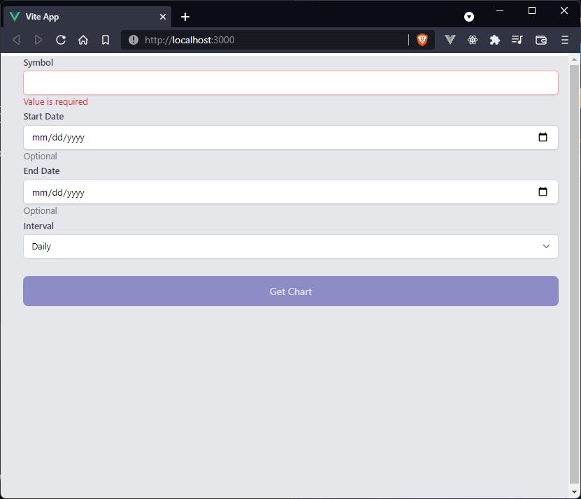
and the form, with the disabled button, looks like
Icons
We hold off on handling logic on a valid form submission until the next article because we first want to include display of icons. We will use this functionality to add a loading spinner to the button while awaiting a response so it makes sense to handle this now. We can use icons from libraries like FontAwesome, Material Design Icons, Google Font Icons, but since we're using Vue, and Tailwind CSS integrates very well with React and Vue (TailwindUI was built for those two frameworks), we can simply install heroicons. We open a terminal/command prompt and type
npm i -D @heroicons/vue
and we should have a set of free icons created by https://twitter.com/steveschoger, who is a partner/designer at Tailwind Labs. Now that we've installed the icons, we can import the icons we need.
Exclamation
We want to add in a little warning icon in the JVPInput.vue component any time data validation fails.
In order to do this, we just need to import the component and register it
import { defineComponent, computed } from 'vue';
import { ExclamationCircleIcon } from '@heroicons/vue/solid';
import inputProps from '../utils/input-props';

export default defineComponent({
  components: { ExclamationCircleIcon },
  props: {
  ...
Then we can very simply add it, conditionally on error state, to the markup inside the <div class="mt-1 relative..." but after the actual input tag
<div
  v-if="isError"
  class="absolute inset-y-0 right-0 flex items-center pointer-events-none"
  :class="type === 'date' ? 'pr-9' : 'pr-3'"
>
  <ExclamationCircleIcon
    class="h-5 w-5 text-red-500"
    aria-hidden="true"
  />
</div>
It is here that we see the importance of including the relative class on the wrapping div, because we want to absolutely position this icon inside of the input.
We also conditionally render the right-padding based on whether the input type is a date, because if it is a date it shows the calendar icon and we don't want to cover that.
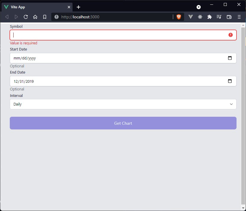
Now an invalid input will include the exclamation icon as needed.
Loading spinner
This is not technically an icon, but we'll add it in the same section because it behaves similarly.
The first thing we need to do is add in an element called loading in the script itself.
It will be a simple boolean that will be false on initialization.
We then need to conditionally render either the loading spinner, if loading === true, or the previously set text, "Get Chart" if not.
Thus, the generic slot in the <button> element is replaced by
<span
  v-if="loading"
  class="
    animate-spin-1.5
    ease-linear
    rounded-full
    border-4 border-t-4 border-gray-200
    h-10
    w-10
    mx-auto
    block
  "
></span>
<span v-else>Get Chart</span>
The animate-spin-1.5 class is a custom class that we'll define in a minute, but the rest are all default Tailwind classes.
ease-linear-> the linear transition-timing-functionrounded-full-> makes the element a circleborder-4 border-t-4 border-gray-200-> border styling around this empty element; this will be what is actually displayedh-10 w-10-> forcing a specific height and widthmx-auto-> centering the element in its containerblock-> making the element a block-level (span is an inline element)
We then need to set up the custom loader class.
This is a simple addition of a <style> tag at the bottom of the component
<style scoped>
.loader {
  border-top-color: #6366f1;
  -webkit-animation: spinner 1.5s linear infinite;
  animation: spinner 1.5s linear infinite;
}

@-webkit-keyframes spinner {
  0% {
    -webkit-transform: rotate(0deg);
  }
  100% {
    -webkit-transform: rotate(360deg);
  }
}

@keyframes spinner {
  0% {
    transform: rotate(0deg);
  }
  100% {
    transform: rotate(360deg);
  }
}
</style>
We are setting a separate color for the top border, which will look like it's the only thing rotating.
Now to test this we can update handleSubmit with to look like
const handleSubmit = () => {
  v$.value.$validate();
  if (!v$.value.$invalid) {
    loading.value = true;
    setTimeout(() => {
      console.log('triggered handleSubmit');
      loading.value = false
    }, 5000)
  }
}
We should now have a loader that is running for 5 seconds, and the console still logs "triggered handleSubmit" on a valid form submission. In the next article we'll handle form submission properly and fetch the data from the FastAPI server that we previously set up.
Code
As a reference, the updated Selections.vue and JVPInput.vue components should look like
Selections.vue
<template>
  <form class="ml-5" @submit.prevent="handleSubmit">
    <div class="my-1">
      <JVPInput
        v-model="state.symbol"
        label="Symbol"
        id="symbol"
        name="symbol"
        type="text"
        placeholder="eg. MSFT"
        :vuelidate="v$.symbol"
        hint="Required, less than 6 characters"
        :autofocus="true"
      />
    </div>
    <div class="my-1">
      <JVPInput
        v-model="state.startDate"
        label="Start Date"
        id="start-date"
        name="startDate"
        type="date"
        :vuelidate="v$.startDate"
        hint="Optional"
      />
    </div>
    <div class="my-1">
      <JVPInput
        v-model="state.endDate"
        label="End Date"
        id="end-date"
        name="endDate"
        type="date"
        :vuelidate="v$.endDate"
        hint="Optional"
      />
    </div>
    <div class="my-1">
      <JVPSelect
        v-model="state.interval"
        label="Interval"
        id="interval"
        :options="intervals"
      />
    </div>
    <button
      type="submit"
      class="w-full h-12 px-6 mt-6 lg:mt-0 rounded-lg bg-indigo-700 text-indigo-100 transition-colors duration-150 hover:bg-indigo-800 focus:shadow-outline disabled:opacity-50 disabled:cursor-not-allowed"
      :disabled="disabled"
    >
      <span
        v-if="loading"
        class="loader ease-linear rounded-full border-4 border-t-4 border-gray-200 h-10 w-10 mx-auto block"
      ></span>
      <span v-else>Get Chart</span>
    </button>
  </form>
</template>

<script>
import { defineComponent, reactive, ref, computed } from 'vue';
import useVuelidate from '@vuelidate/core';
import { required, maxLength, helpers } from '@vuelidate/validators';
import JVPInput from './JVPInput.vue';
import JVPSelect from './JVPSelect.vue';

export default defineComponent({
  components: { JVPInput, JVPSelect },
  setup() {
    const intervals = ['Daily', 'Weekly', 'Monthly'];

    const state = reactive({
      symbol: '',
      interval: 'Daily',
      startDate: '',
      endDate: '',
    });

    const mustBeEarlierDate = helpers.withMessage(
      'Start date must be earlier than end date.',
      (value) => {
        const endDate = computed(() => state.endDate);
        if (!value || !endDate.value) return true;
        if (!checkDateFormat(endDate.value)) return true;
        return new Date(value) < new Date(endDate.value);
      }
    );

    const checkDateFormat = (param) => {
      if (!param) return true;
      return new Date(param).toString() !== 'Invalid Date';
    };

    const validateDateFormat = helpers.withMessage(
      'Please enter a valid date.',
      checkDateFormat
    );

    const rules = {
      symbol: { required, maxLength: maxLength(5) },
      startDate: {
        validateDateFormat,
        mustBeEarlierDate,
      },
      endDate: {
        validateDateFormat,
      },
    };
    const v$ = useVuelidate(rules, state);

    const disabled = computed(() => {
      return v$.value.$invalid;
    });

    const loading = ref(false);

    const handleSubmit = () => {
      v$.value.$validate();
      if (!v$.value.$invalid) {
        loading.value = true;
        setTimeout(() => {
          console.log('triggered handleSubmit');
          loading.value = false;
        }, 5000);
      }
    };

    return {
      intervals,
      state,
      disabled,
      loading,
      v$,
      handleSubmit,
    };
  },
});
</script>

<style scoped>
.loader {
  border-top-color: #6366f1;
  -webkit-animation: spinner 1.5s linear infinite;
  animation: spinner 1.5s linear infinite;
}

@-webkit-keyframes spinner {
  0% {
    -webkit-transform: rotate(0deg);
  }
  100% {
    -webkit-transform: rotate(360deg);
  }
}

@keyframes spinner {
  0% {
    transform: rotate(0deg);
  }
  100% {
    transform: rotate(360deg);
  }
}
</style>
JVPInput.vue
<template>
  <div>
    <label :for="id" class="block text-sm font-medium text-gray-700">
      {{ label }}
    </label>
    <div class="mt-1 relative rounded-md shadow-sm">
      <input
        :value="modelValue"
        :type="type"
        :name="id"
        :id="id"
        class="block w-full sm:text-sm rounded-md shadow-sm"
        :class="dynamicClass"
        :aria-invalid="isError"
        :aria-describedby="hintId"
        :autofocus="autofocus"
        @input="updateValue"
        @blur="vuelidate.$touch"
      />
      <div
        v-if="isError"
        class="absolute inset-y-0 right-0 flex items-center pointer-events-none"
        :class="type === 'date' ? 'pr-9' : 'pr-3'"
      >
        <ExclamationCircleIcon
          class="h-5 w-5 text-red-500"
          aria-hidden="true"
        />
      </div>
    </div>
    <p v-if="hasHint" class="mt-0 text-sm" :class="hintClass" :id="hintId">
      {{ hintText }}
    </p>
  </div>
</template>

<script>
import { defineComponent, computed } from 'vue';
import { ExclamationCircleIcon } from '@heroicons/vue/solid';
import inputProps from '../utils/input-props';

export default defineComponent({
  components: { ExclamationCircleIcon },
  props: {
    type: {
      type: String,
      required: false,
      default: 'text',
    },
    placeholder: {
      type: String,
      required: false,
    },
    vuelidate: {
      type: Object,
      required: false,
      default: () => ({}),
    },
    autofocus: {
      type: Boolean,
      required: false,
      default: false,
    },
    ...inputProps,
  },
  emits: ['update:modelValue'],
  setup(props, { emit }) {
    // This is simply cleaner than putting emit code in the HTML
    const updateValue = (e) => emit('update:modelValue', e.target.value);

    // Vuelidate is used as a validation library.
    // We use built-in functionality to determine if any rules are violated
    // as well as display of the associated error text
    const isError = computed(() => props.vuelidate.$error);
    const errorText = computed(() => {
      const messages =
        props.vuelidate.$errors?.map((err) => err.$message) ?? [];
      return messages.join(' ');
    });

    // This is solely to style the input based on whether it is in an error state or not
    const dynamicClass = computed(() => {
      // This is to remove padding on the right for the built-in calendar icon when using a date type
      let val = props.type === 'date' ? '' : 'pr-10';
      return isError.value
        ? `${val} border-red-300 text-red-900 placeholder-red-300 focus:outline-none focus:ring-red-500 focus:border-red-500`
        : `${val} focus:ring-indigo-500 focus:border-indigo-500 border-gray-300`;
    });

    // The "hint" text will display any necessary hints as well as any error messages.
    // Styling and values of said hint text are primarily based on whether an input is in an error state.
    const hintClass = computed(() =>
      isError.value ? 'text-red-600' : 'text-gray-500'
    );
    const hintId = computed(() =>
      isError.value ? `${props.id}-error` : `${props.id}-input`
    );

    const hintText = computed(() => {
      if (errorText.value.length > 0) return errorText.value;
      if (!!props.hint) return props.hint;
      return '';
    });

    const hasHint = computed(() => !!hintText.value.length);

    return {
      hasHint,
      hintText,
      hintClass,
      hintId,
      dynamicClass,
      isError,
      autofocus: props.autofocus,
      vuelidate: props.vuelidate,
      updateValue,
    };
  },
});
</script>